Media Studies
by Evans
The Collage Concept
As this was a first edition, I had the creative freedom to explore a wide range of visual directions. For every project, I provide 2–3 distinct concepts to ensure the author's vision is fully explored.
This "wild card" design uses a contemporary collage style to represent the layered, fast-paced nature of modern media.
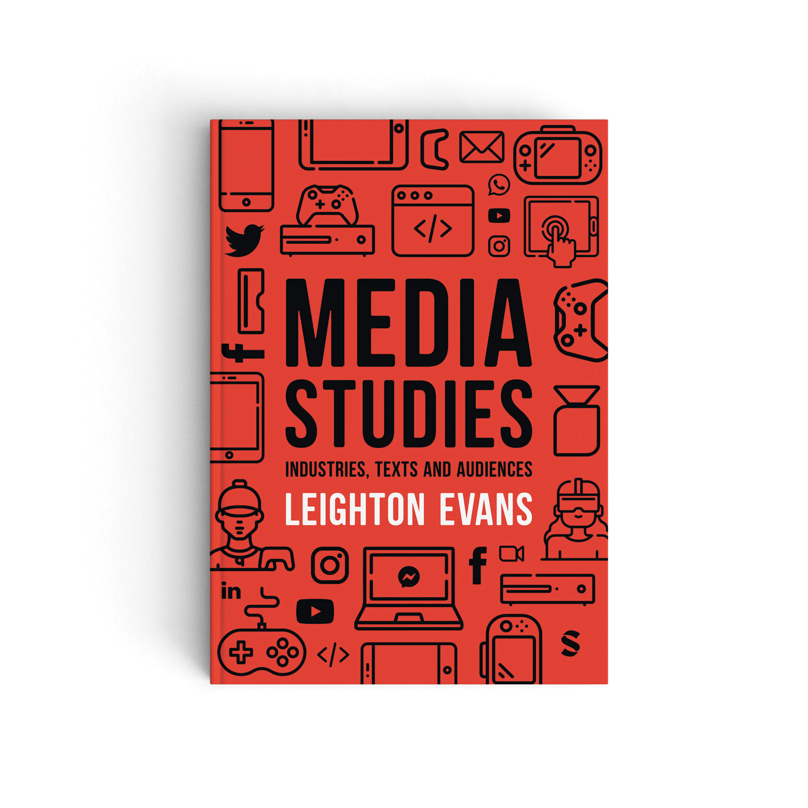
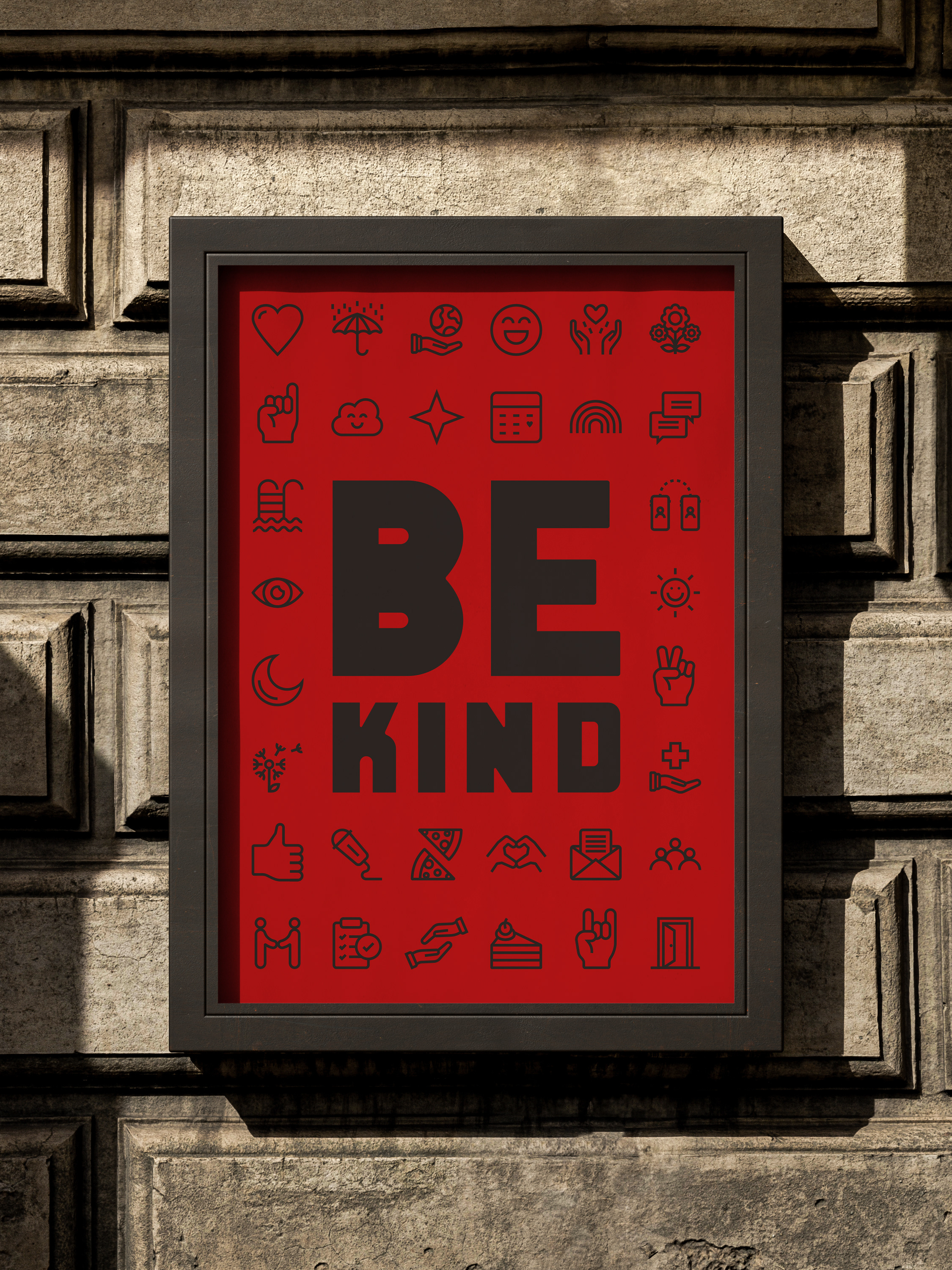
The Iconic Concept (Red)
Taking a literal request from the brief, I developed a high-contrast, black, red, and white layout. It uses a custom icon library to symbolise the diverse topics within media studies, creating a strong, authoritative presence.
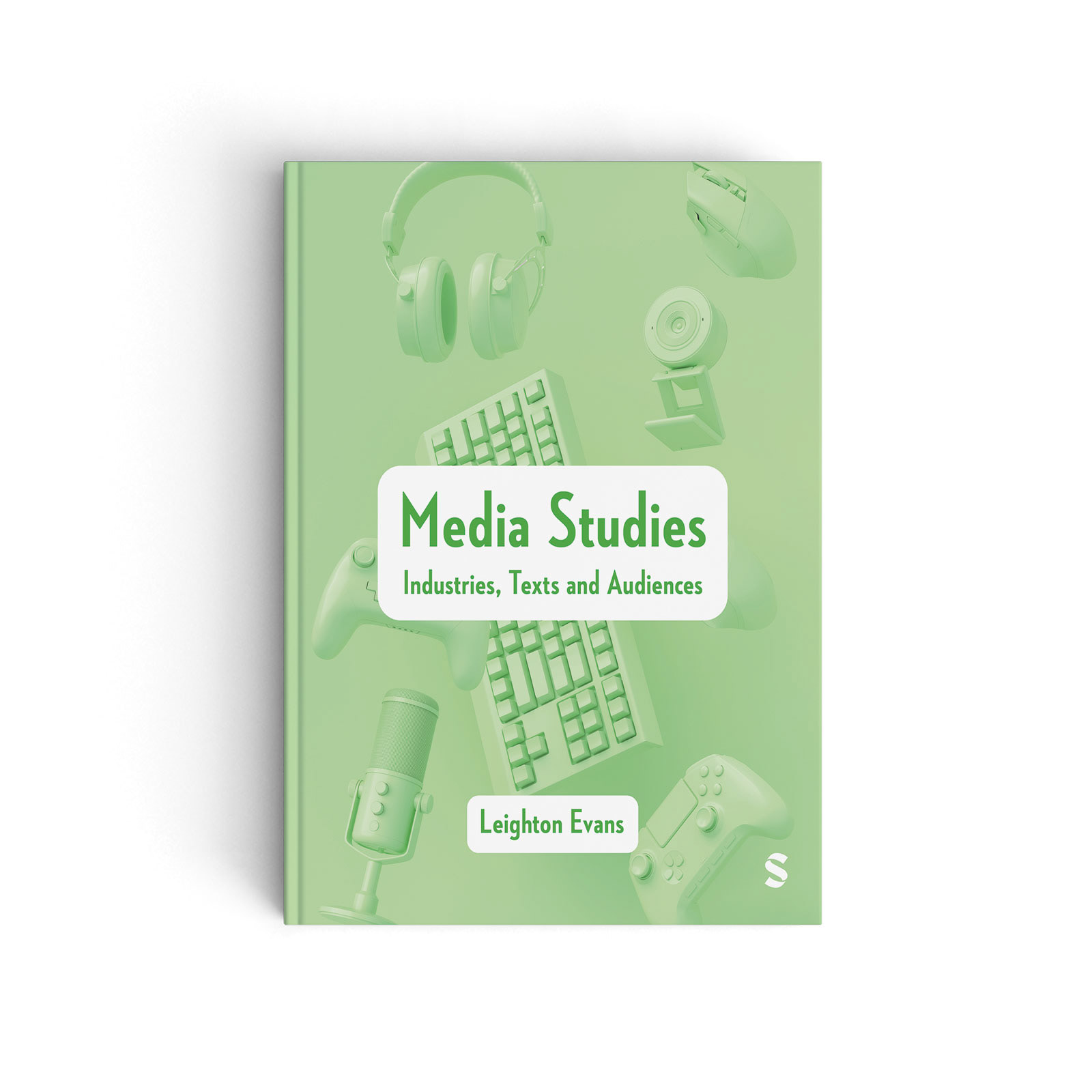
The Selected Design (Green)
The final chosen cover focuses on a singular, impactful image. While more traditional, it provides a clear and accessible entry point for the reader and aligned perfectly with the author's preference for simplicity.
