Food Icon Set
Should I Eat There?
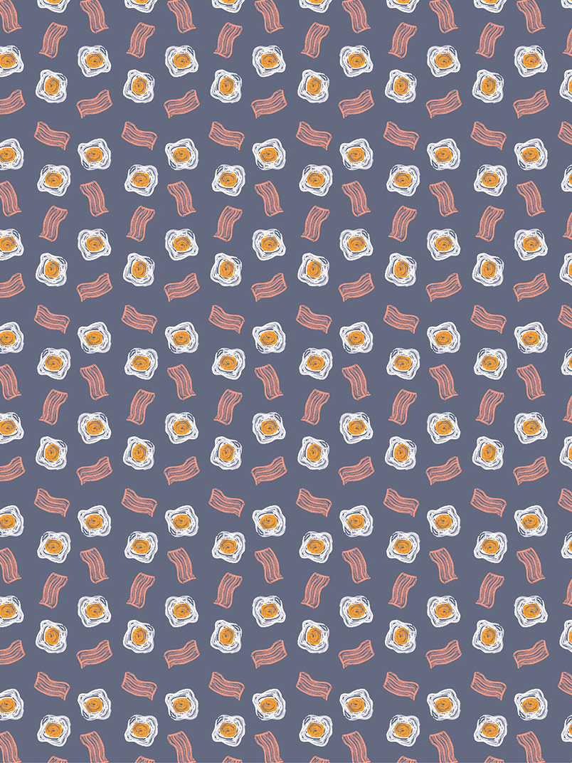
I was commissioned to design a custom icon set for the food rating platform, Should I Eat There?
To ensure visual harmony, I designed each icon using a grid system with a uniform stroke weight. Following the client’s brief for high legibility at small scales, I prioritised a minimalist aesthetic that remains clear and impactful even in constrained interfaces.


