GotDis
Website v1.0
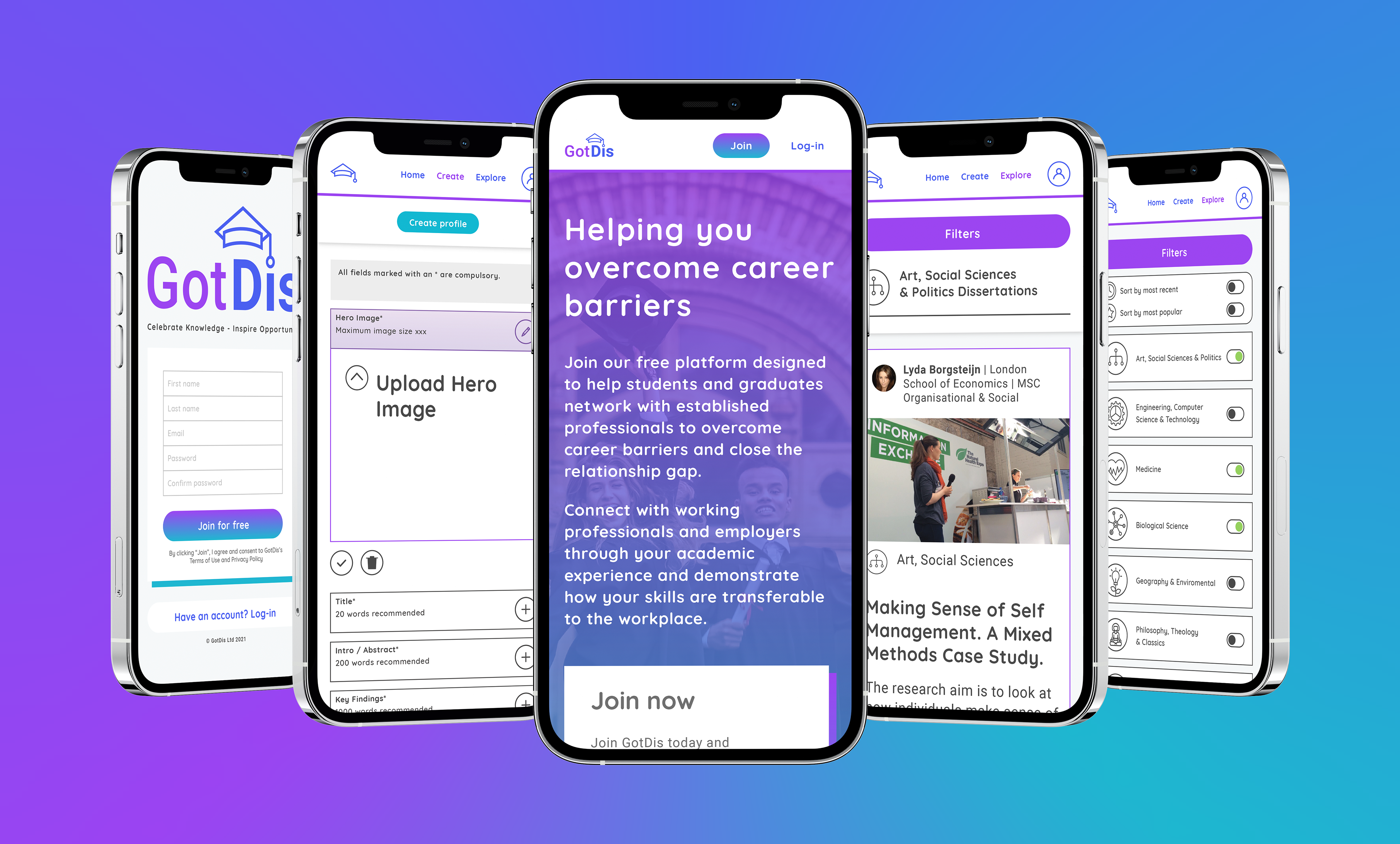
High-Fidelity Wireframes
What began as pen-and-paper sketches evolved into a comprehensive digital ecosystem for GotDis' first website iteration. I led the UX/UI journey from basic wireframes to a high-fidelity landing page designed to optimise student conversions. I designed the entire website using Adobe XD.
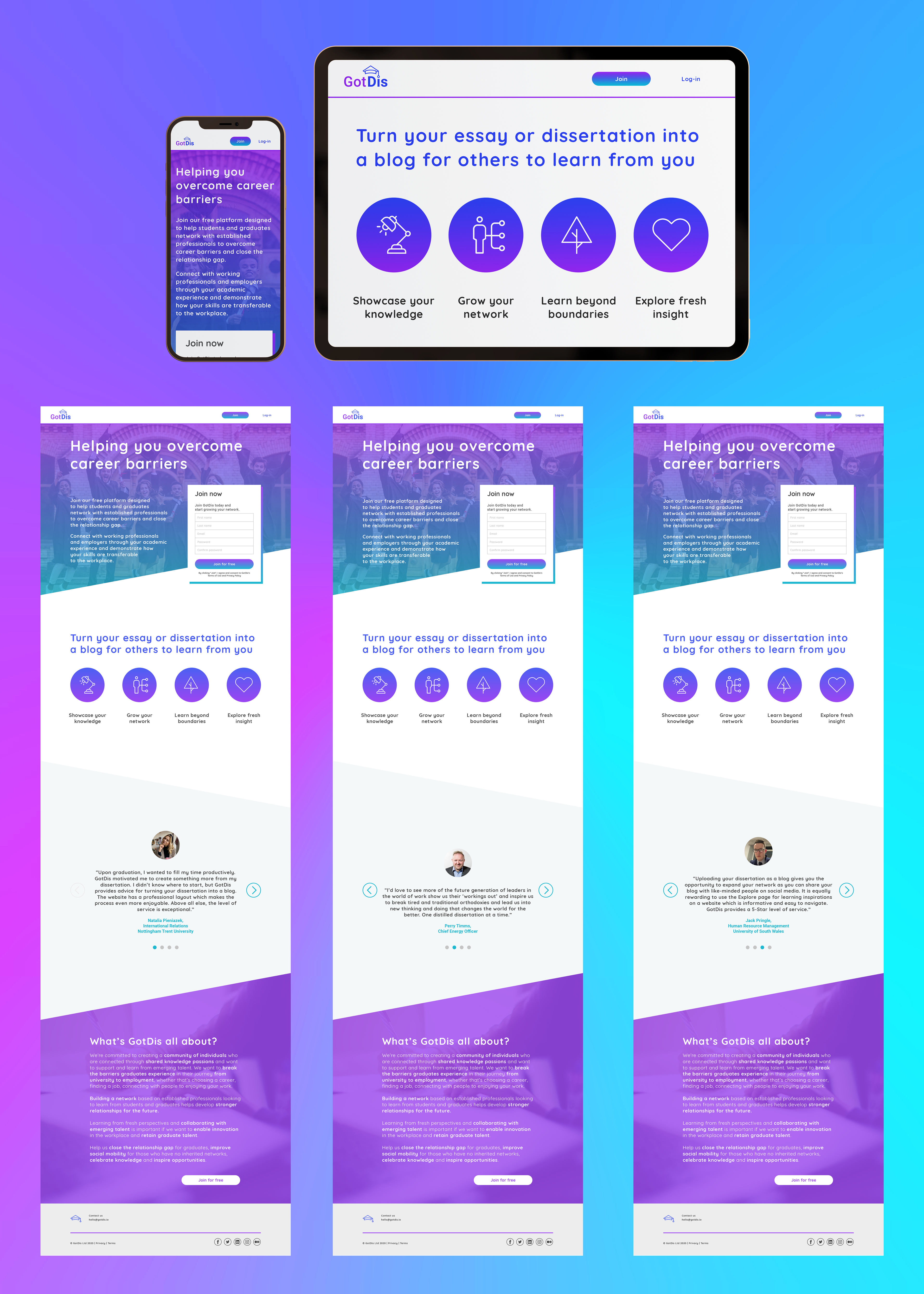
Below is the landing page redesign showing the call-to-action ‘Join for free’ box as the aim is to get more students to join the platform.
Recently, I led a strategic pivot of the digital presence, redesigning the website in Wix to align with the company's new direction.
Check out the new GotDis website here.